 Branding
Beautiful Internet: 10 of the Best Fonts for the Web

By Eric Groves
At Flying Hippo, we’re sort of font snobs. We’re constantly on the hunt for the best web fonts. In particular, there are 10 web fonts that we use quite frequently in our web projects. Each font family has its own character, look, feel and different variations. With a rich selection of styles for each of these fonts, there are many ways to incorporate them into our web designs.
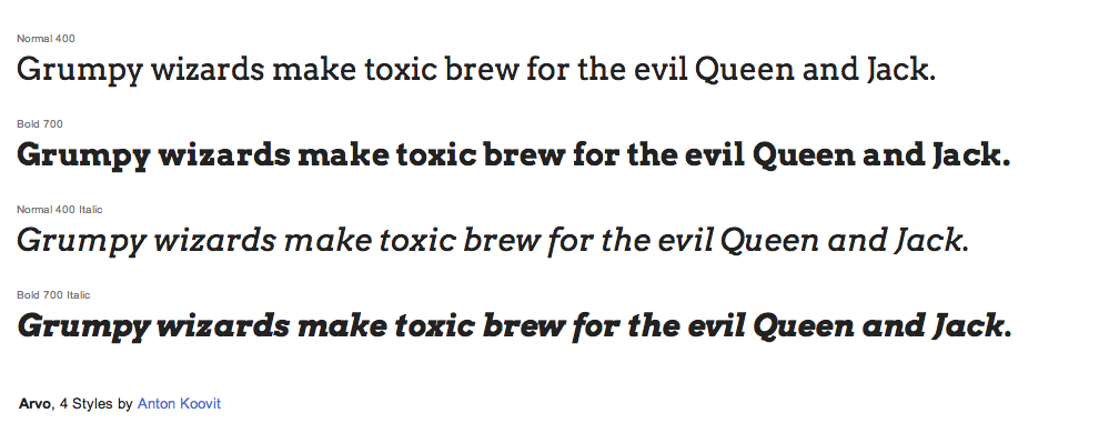
10. Arvo
Arvo is a very good slab serif font family, created by Anton Koovit. It has 4 different variations, from normal weight and normal italic to bold italic. It is pretty rare to find a full Slab Serif web font family and this font gets pretty close to satisfying all of our needs for strong characters and high readability. Combined with a sans-serif body font, Arvo makes a great font for titles and subtitles.
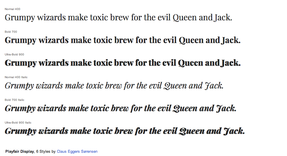
9. Playfair Display
Playfair is a unique font, created by Claus Eggers Sørensen. We like it mostly for its non-traditional, gentle serifs and nice italic style. It has classic letterforms of high contrast and delicate hairlines. It’s one of our top choices for a serif font other than the commonplace fonts like Georgia and Time New Roman. We generally use Playfair to add a “classic” feel to site headlines and titles.
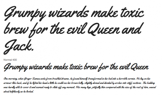
8. Yellowtail
Yellowtail is a really fun script font. It is inspired by flat brush typefaces with medium weight and has its type style built on Gillies Gothic and Kaufmann. It has a very unique look and tends to be legible even at smaller sizes. We suggest keeping it above 14 pixels for higher readability.

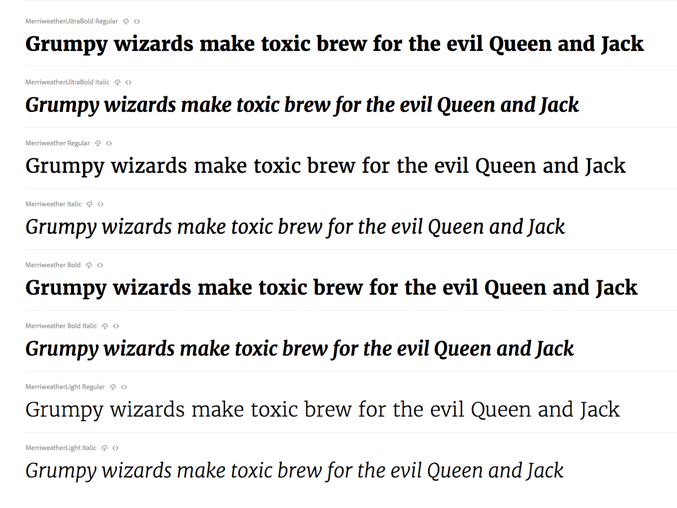
7. Merriweather
This is one of our favorite serif fonts. Merriweather has a very geometric feel and is very readable at small sizes. It can even be used as a body typeface because of its natural letter width and weight. Your body copy is going to look great when it has the Merriweather treatment.
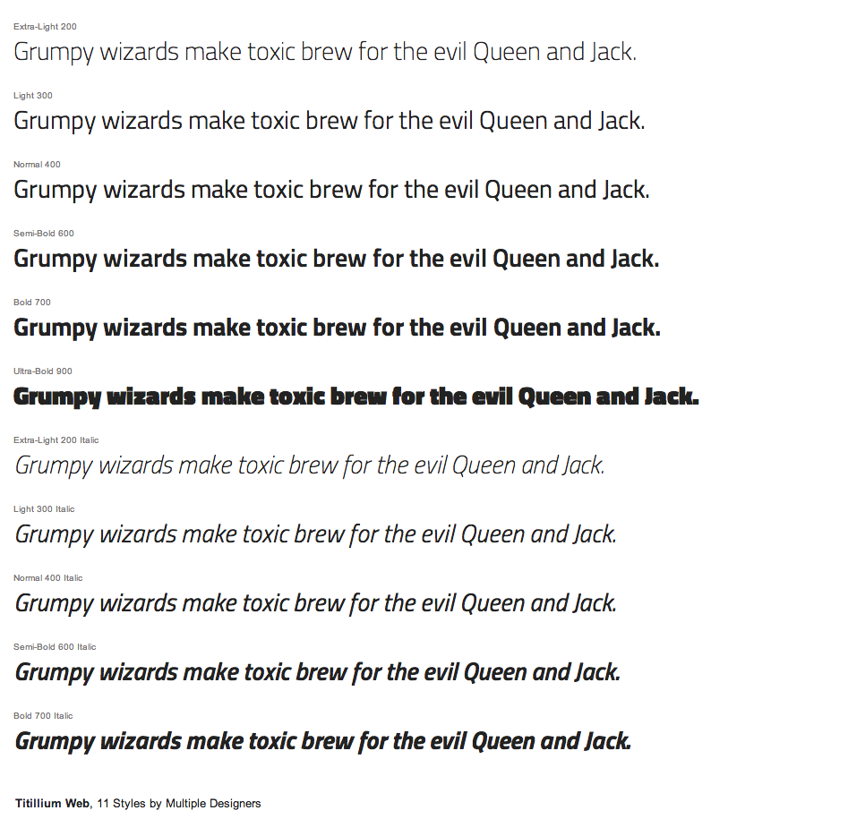
6. Titillium Sans and Dosis
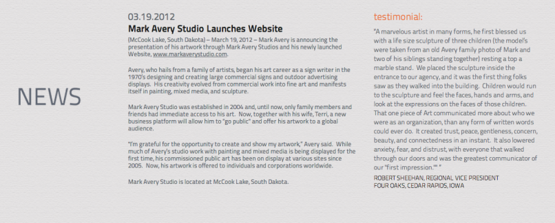
Titillium is a very nice sans serif font. It has very strong letterforms that will allow you to use it for headers or as body text. We like it because it has a “modern” feel and also a pretty extensive font family with different weight variations. It is highly readable at 8 pixels and above. We used it on the artist portfolio website shown below.
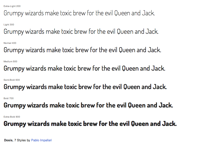
Dosis is another font that has a very unique and “modern”, clean look. Its letters have a more-rounded shape but it will add a lot of character and legibility to your website. It has light weights that can be used in large titles. Both of these fonts can help to add more character to your designs.
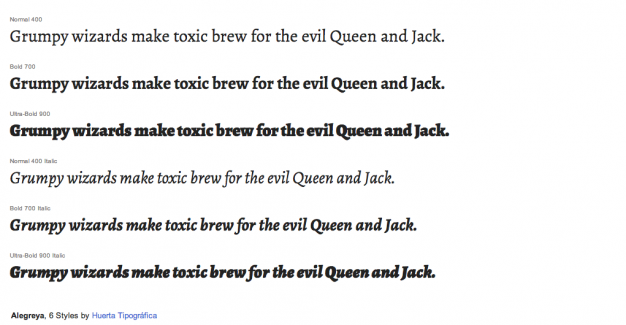
5. Alegreya
Alegreya is a great serif font to substitute for any default serif web font. It was originally intended for literature with its various letterform weights and high readability. The font has a calligraphic feel and also incorporates more of a modern serif look. It’s definitely in the top of our favorite fonts.
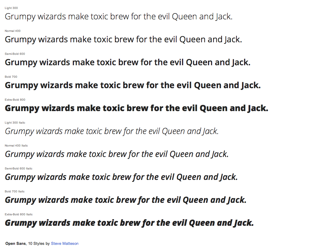
4. Open Sans
We have noticed that Open Sans has become one of the most used fonts on the web. A lot of big-name brands are going through the process of cleaning up their websites and a lot of them go with Open Sans or Lato to offer high readability and friendly appearance. Open Sans has excellent legibility and its letterforms are incredibly strong with the very extensive font library, this font is a very strong substitute for default sans serif fonts.
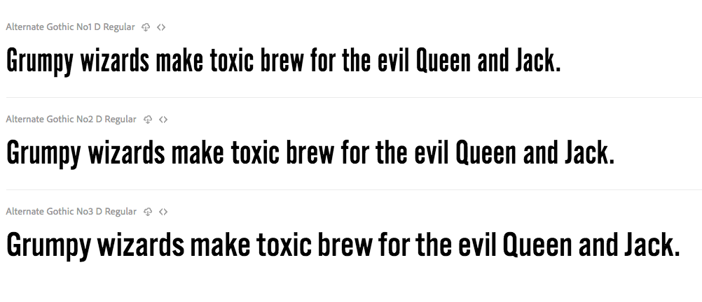
3. Alternate Gothic
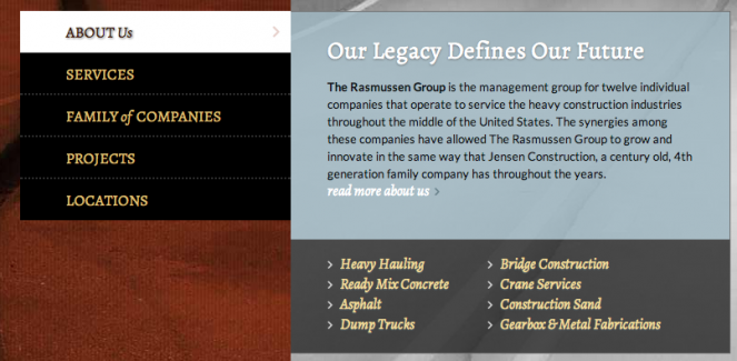
We love this font and we use it whenever we need to mix our body text or add a clean feel to our site. Alternate Gothic was designed by Morris Fuller Benton as a counterpart to Franklin Gothic, and it looks great when it’s used on headings. Along with this font, we really like the match of Alternate Gothic and Proxima Nova, which is used together on the Grand Blue Mile site.
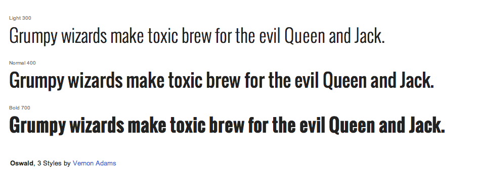
2. Oswald & Abel
If you are looking for a condensed sans serif font that looks like League Gothic, Oswald is the strongest contender. It is a great font that is inspired by the classic newspaper headlines, and was designed specifically for free use on the web and editorial materials.

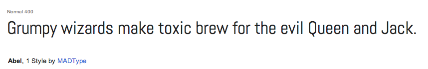
Abel is another great modern, condensed font. Originally used in news headlines and posters, this font also works well for the web. Its strong letterforms are perfect for big headlines and headers, while at smaller sizes it stays legible. We wish there were more weight choices, but it is possible it will have additions to the family later on.
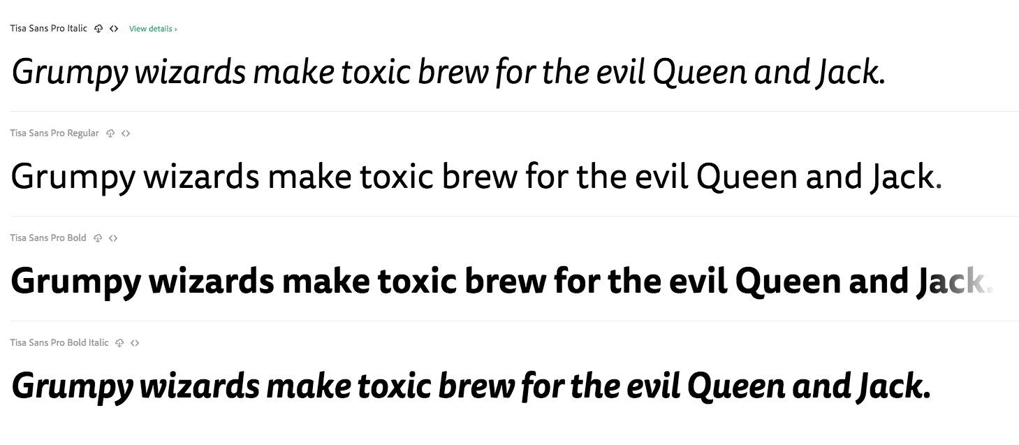
1. Tisa
Tisa is probably the best substitute for the default Helvetica or Arial on the web. It is also the number one font we choose whenever we want to add more character to the site design while maintaining a clear, readable style.
If readability is what you want, Tisa is extremely legible in many text sizes while creating a unique design display.